When the global pulp and paper industry moves, we report it first — trusted by 6,000 subscribers across 80 countries

Love Unveils Fresh Packaging Redesign for Sol Beer, Elevating Brand Identity
PAPER INDUSTRY NEWS
Jino John
12/2/20251 min read
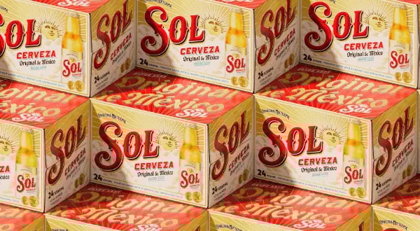
The Manchester-based creative agency said the redesign aims to position it as the beer of choice with young adult consumers and re-establish its status as the original through craft and premiumisation.
As part of the redesign and overall premiumisation, the LOVE team worked with illustrator and lettering artist Tobias Hall to redraw all key design elements on the bottle label, from the Sol wordmark to the background clouds, secondary lettering and iconic sun face.
For the new wordmark, Hall looked to the beautifully idiosyncratic and evocative lettering of Sol’s historic labels, breathing new life into the letterforms with richly crafted detailing.
The central sun icon has also been enriched with ‘deeper storytelling’, elevating it from its previous role as a mere functional background. Showing its full face for the first time, with an open, upward gaze toward a bright future, it has been recast as a radiant, optimistic symbol of Sol’s heritage.
A vibrant colour palette focuses on Sol’s iconic red and gold, while introducing teal to represent a crisp, clear blue sky and the liquid’s freshness.
Bespoke supporting type reflects the brand’s origin story through a diverse mix of font styles reminiscent of ornate archive labels.
The illustration of the Paris Exposition gold medal won by the brand in the early 1900s has also been fine tuned in a contemporary style that heightens its significance on pack.
Eric Halgand, global brand lead, Sol, said: “Sol is the original Mexican lager, and features a unique history – and this striking new visual identity honours this heritage whilst staying true to its uplifting, sunny positioning. After meticulous development, we’re thrilled to unveil the new look for the brand across the world, alongside the smooth, refreshing taste of Sol, perfect for consumers to enjoy whilst they unwind and recharge.”
Eve Warren, design director, LOVE, added: “By focusing on design that is both emotionally resonant and commercially impactful, we aim to set Sol apart from competitors. The new identity marks a bold return of Sol’s authenticity and heritage, shaped for young adult beer drinkers.”